
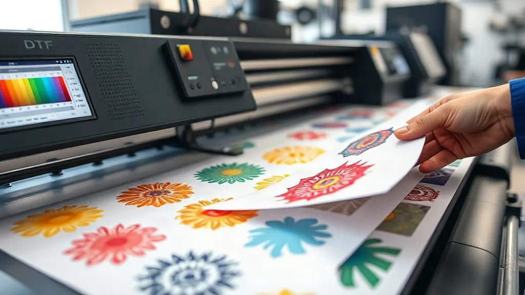
You've spent hours perfecting a design, only to find the colors on the finished DTF gangsheet look dull or shifted. It's a common frustration that can eat into profits and damage your reputation. Color consistency isn't just about having a good printer; it's about controlling the variables from file to fabric. In this guide, we'll walk through the key factors that affect color on a DTF Gangsheet and give you actionable steps to achieve reliable, repeatable results.
Why Color Consistency Matters on a DTF Gangsheet
When you produce a gangsheet, you're putting multiple designs onto a single sheet of film. If colors vary across the sheet, or from one sheet to the next, customers notice. Inconsistent color leads to rejected orders, reprints, and wasted materials. For businesses, that's lost time and money. For hobbyists, it's frustration. Mastering color consistency ensures every transfer looks as intended, whether you're printing one sheet or a hundred.
Start with a Color-Managed Workflow
Color management is the foundation of consistent output. Without it, you're guessing. Here's how to set up a workflow that works.
Calibrate Your Monitor
Your monitor is your window into the design. If it's not calibrated, you're editing colors that won't match the final print. Use a hardware calibrator to set your monitor to a known standard like sRGB or Adobe RGB. This ensures what you see on screen is a reliable reference.
Use the Right ICC Profiles
ICC profiles tell your printer how to reproduce colors on a specific substrate. For DTF, you need profiles tailored to your printer, ink, and film combination. Most printer manufacturers provide profiles, but for ultimate accuracy, consider custom profiling with a spectrophotometer. Without the correct profile, colors can shift dramatically.
Soft Proofing in Your Design Software
Soft proofing simulates how colors will look when printed. In Adobe Photoshop or Illustrator, you can enable soft proofing with your DTF profile. This helps you spot out-of-gamut colors and adjust before printing. It's a quick step that saves film and ink.
RIP Software Settings That Affect Color
Your RIP (Raster Image Processor) software is the bridge between your design and the printer. The settings you choose here have a huge impact on color output.
Ink Limits and Color Separation
DTF printing uses CMYK plus white ink. Setting the right ink limits prevents over-inking, which can cause bleeding and color shift. Your RIP should have default limits for your printer, but you may need to tweak them based on your film and environmental conditions. Also, ensure that color separation settings are optimized for DTF, as some RIPs default to other printing methods.
Rendering Intent
Rendering intent determines how out-of-gamut colors are handled. For photographs, perceptual intent often works best, while relative colorimetric is good for logos and spot colors. Experiment with your RIP's rendering intent options to see what gives the most accurate results for your typical designs.
White Ink Management
White ink is crucial for DTF, especially on dark fabrics. But too much white ink can cause a halo effect, while too little leads to poor opacity. Your RIP should allow you to control white ink density and choke. Choke slightly underbase the white layer so it doesn't peek out around the edges of your design.
Choosing the Right Film and Powder
Not all DTF films are created equal. The film's coating affects how ink adheres and how colors appear. A high-quality film with a consistent coating will yield better color reproduction. Similarly, the powder you use for adhesive can impact the final feel and color vibrancy. Always test new batches of film and powder to ensure consistency.
Fabric Variables: The Unseen Factor
Even with perfect printing, the fabric you press onto can alter color perception. Different fabrics absorb ink differently, and their base color affects the final look. For example, a white design on a black shirt will appear different than on a gray shirt. Always consider the fabric when evaluating color accuracy. If you're printing a gangsheet for multiple fabric types, test presses on each to anticipate shifts.
Step-by-Step Color Consistency Checklist
Follow this checklist each time you prepare a DTF Gangsheet to minimize color variations.
- Calibrate your monitor regularly, at least monthly.
- Update ICC profiles when you change ink or film brands.
- Soft proof your designs before printing.
- Verify RIP settings for ink limits, rendering intent, and white ink.
- Perform a nozzle check and clean printhead as needed.
- Print a test strip with color patches and inspect for consistency.
- Press a sample on the actual fabric to check final color.
- Record settings for future reference.
Common Color Issues and Fixes
Colors Look Dull or Muddy
This often indicates insufficient ink or incorrect ICC profile. Check ink levels, ensure you're using the correct profile, and try increasing ink limits slightly.
Colors Shift Between Sheets
Inconsistent film batches or environmental changes can cause this. Store film in a stable environment and always use the same brand and type. If you must switch, re-profile.
White Ink Looks Gray or Yellow
White ink can appear off if it's not properly mixed or if the printer sits idle. Agitate white ink regularly and perform daily maintenance.
Frequently Asked Questions
How often should I calibrate my monitor for DTF printing?
Calibrate your monitor at least once a month, or whenever you notice colors looking off. Consistent calibration ensures your edits are based on accurate color.
Can I use the same ICC profile for different DTF films?
No, different films may require different profiles due to variations in coating. Always use a profile specific to your film and printer combination.
Why do my colors look different after pressing?
Pressing temperature, pressure, and fabric type all affect final color. Always press a sample on the actual fabric to see the true result.
What is the best rendering intent for DTF?
It depends on your design. Perceptual is good for photos, relative colorimetric for logos. Test both to see which gives the most accurate colors for your work.
How can I prevent color shifts when printing large gangsheets?
Ensure your printer is stable, use consistent film and ink, and maintain a controlled environment. Also, print a test strip at the beginning and end of each sheet to check for drift.